Selling your products and services has been with us for thousands of years. It started with trading shells, moved onto exchanging goods for other types of goods and finally money was invented as the universal means of exchange.
It was simple. You took your goods down to the local community market, set up your stall and started selling.
Today it is a little more complex. We not only have compulsory regulations, taxes and insurances to deal with but a more recent and sometimes painful and convoluted invention. Technology.
Some of us deal better with it than others but if you want to sell online you need to grapple with technology. You have no choice. You can outsource it to others or you can do it yourself.
As technology has evolved the visible programming is slowly being removed and replaced by intuitive interfaces. These don’t require a degree in computer coding.
It can be simple
For bloggers it can be made simple by using a WordPress template, setting up a simple payment system such as Selz.com and start selling. The old previous generation payment systems and gateways involved many moving parts. Today, you can be up and selling your products on your blog in a matter of minutes. You can use Selz as an effortless way to help build an email list if giving away a ebook or other digital item for free. More details further in the post.
The big mistake
But there is one big mistake that many bloggers and website marketers fall into when selling online. They spend a lot of money and advertise on Facebook and Google to send people to their homepage.
Now your homepage may look great but is trying to do a lot of things. There is a lot going on. It has menu tabs and other elements such as:
- About us
- Products and services
- Contact us
- Different images
- Many links
You need something that is much simpler.
You need a landing page
What is a landing page? A landing page is a website page that is specifically designed to do one thing.
Capture a website visitor’s information. Now that is simple.
It has a form and explanatory words to optimize capturing their name and email. That is it. You are not trying to do anything else. It is just trying to achieve the goal of building that email list.
Two key types of landing pages
Now there are some different types of landing pages but there are two key types you need to know about.
1. Lead generation landing page
This has one primary goal. Collecting information. In its simplest form that includes just a name (first name will do) and an email.
That is called list building.
That list can be used for marketing to your prospects later and it also can be for delivering free content. There is another term that is used often to describe this and it is “squeeze page”.
To provide an optimal lead generation landing page you will need to offer something for “free” Why? If you are asking your website visitor for their email address you need to offer something in return. This will increase your email list building rate by 200-400%.
That free something can be any of the following.
- Free ebook
- Free instructional video
- Whitepaper
- Email course
- Free software
The list goes on. It needs to be digital and perceived to be valuable.
Setting this up is again become easier with new technology You can have this ready in minutes if using something like Selz.com which handles the capturing of the email and automatically delivers the free digital item to the subscriber. You then link Selz up to your email solution like Aweber or Mailchimp so that email subscribers are automatically added to your email list.
As well as not requiring any programming and being so effortless that anyone can do it, you can use Selz to do this for free if your digital item is free.
2. The sales landing page
Once you have their email and their name you can start to engage with your prospect. That means building credibility and trust over time. This can be done by providing a stream of free and valuable content. The bigger the sale the more trust building is required. The final goal? Getting the sale.
The sales landing page will have more information than the lead generation page. It will need to convince the prospective customer by providing them with the details they need to know to make them click on that “buy” button and hands over their hard earned cash.
The principles of a great landing page
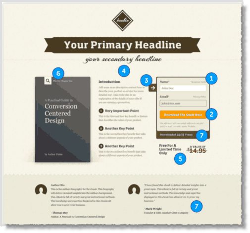
According to Unbounce a sales landing page based on “Conversion Centered Design” should have seven key elements which are in the two categories of design and psychology.
Design
- Encapsulation
- Contrast & color
- Directional cues
- White space
Psychology
- Urgency and scarcity
- Try before you buy
- Social proof
Here is how that would look in a sample design from Unbounce below.
4 examples of landing pages
So we have looked at the key elements that go to designing that “great” landing page. What are some real life examples of successful landing pages.
Here are four to get you started.
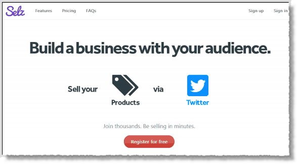
#1. Selz
Now a home page can be a landing page if you keep it simple and design it with a call to action .
Here Selz.com is offering a free registration to “Build a Business”
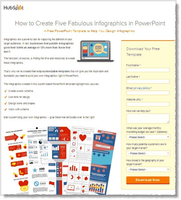
#2. Hubspot
Hubspot was one of the original inspirations for me as a blogger and are a great example of how to use content to market your business.
Their landing pages ask for more information than most but are used to provide a more detailed and comprehensive profile of their customer that feeds into their database. This allows them to really understand their prospective customers.
This example is not about selling a product but building an email list. Free content in exchange for your name and email.
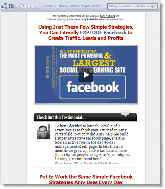
#3. Amy Porterfield
This is a “Sales landing page”. It is a long page and I am only showing you a small section at the top of the page. You can see how Amy uses this style of sales page to explain why you should buy her Facebook training course by clicking here.
#4. Copyblogger
This is a list building page. No selling is happening here except “selling” you on the idea of handing over your name and email address. This page displays the art of simplicity. It is also about building an email list.
What about you?
Do you have a landing page? If you do, could you do better? Look forward to hearing your stories and insights in the comments below.
The post Are You Making this Big Mistake When Selling Online? appeared first on Jeffbullas’s Blog.

